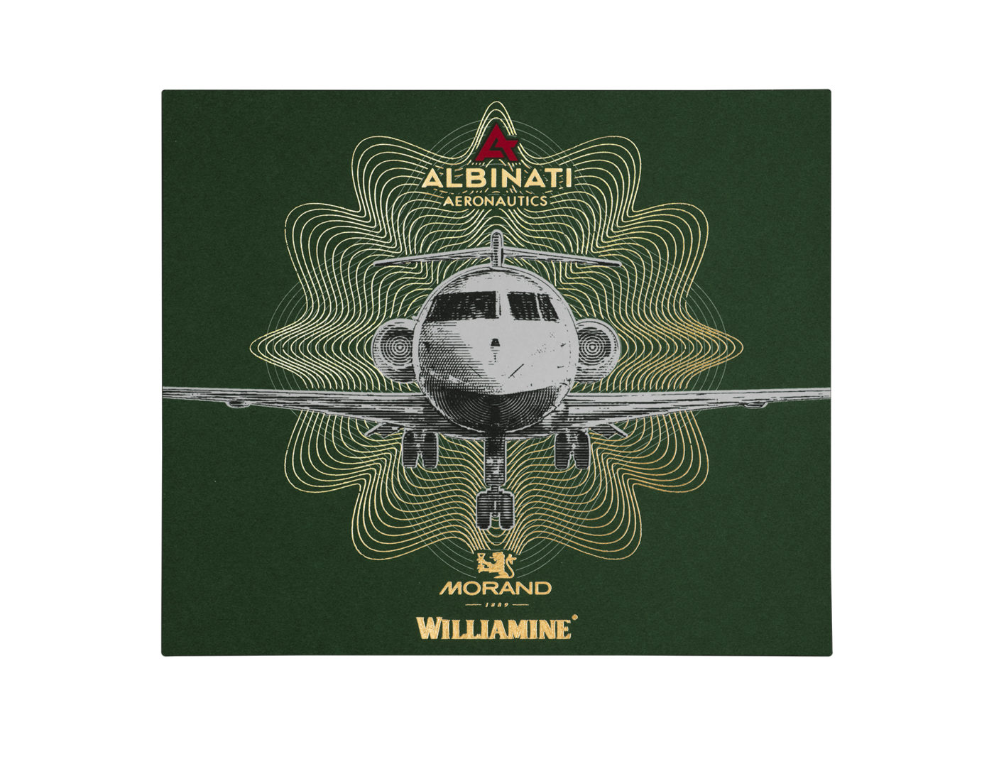
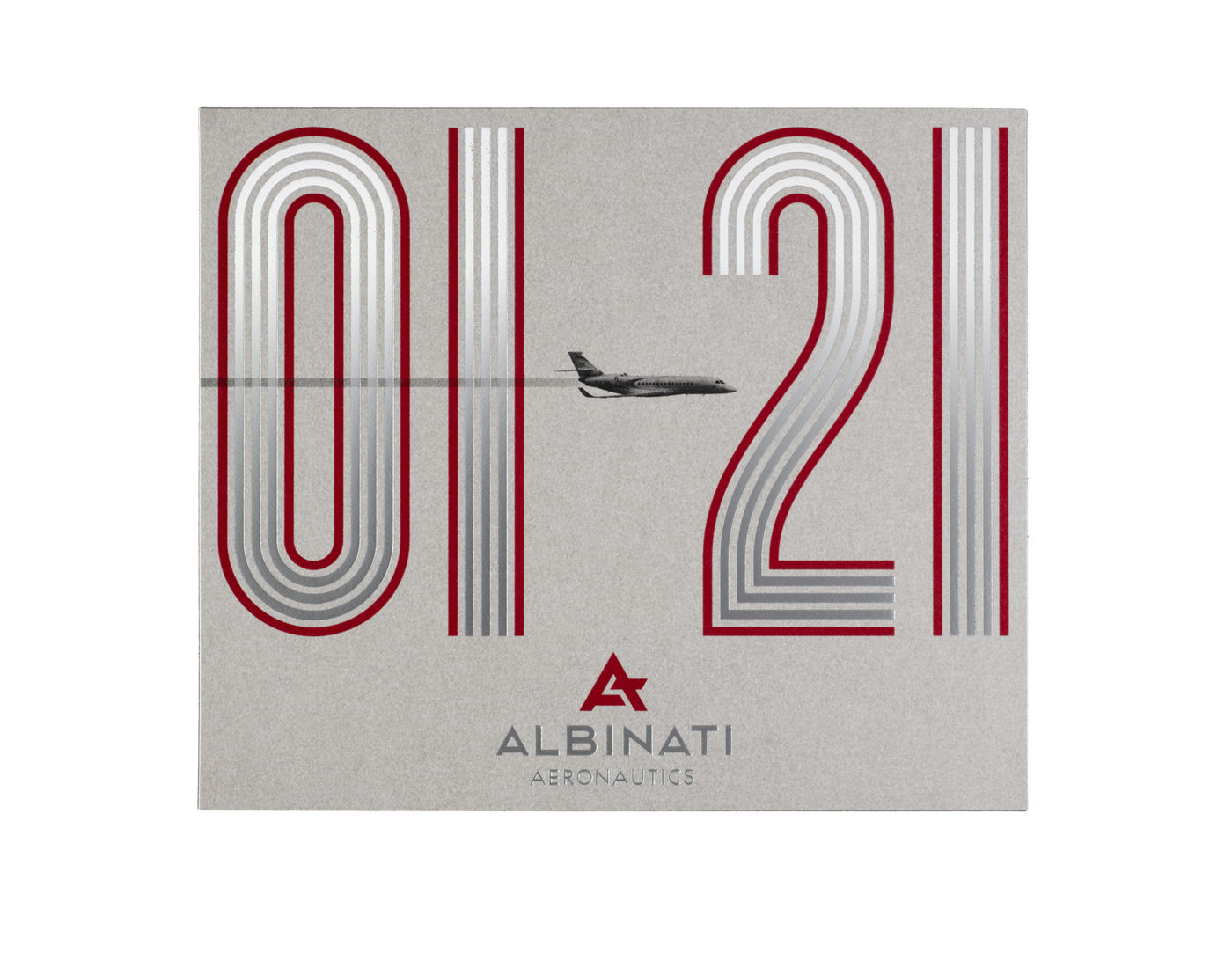
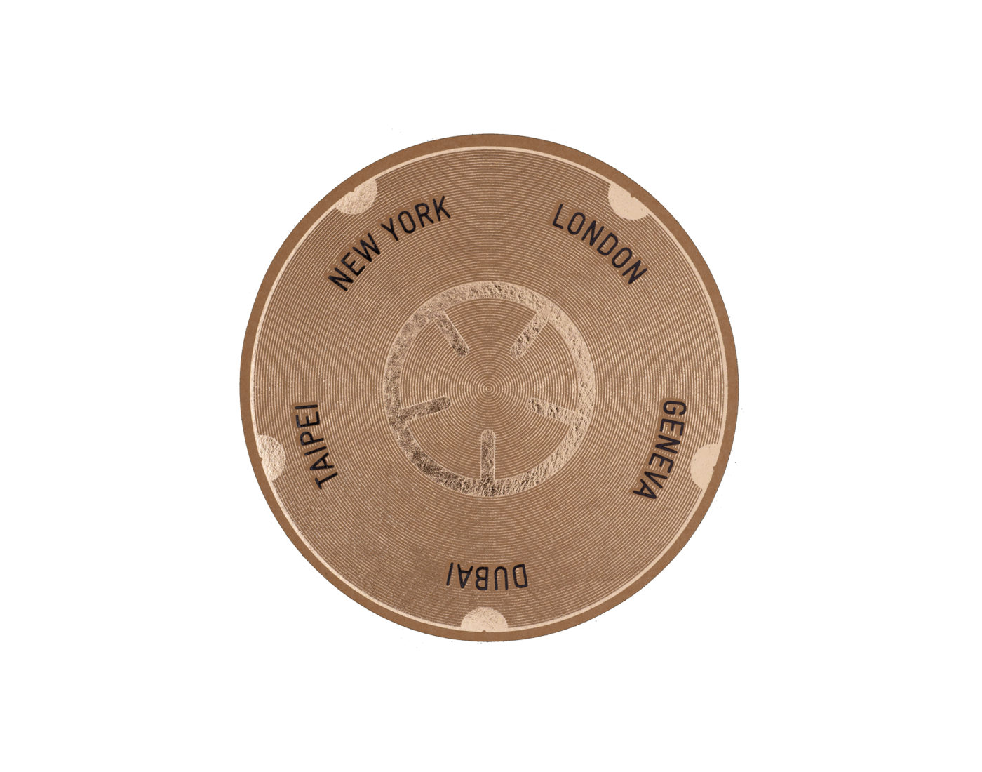
Helming a small multidisciplinary studio in the city of Lausanne, Jeremia Adatte practises a creativity that belongs to one of the main paths of European design: the desire to merge image and physical object. Trained as a graphic designer, Jeremia creates things with a message and messages that are objects. The best examples of this are the labels he has printed at Vidal & Armadans. Corporeal in appearance, tactile and almost “graspable” in their two-dimensionality. His work for the aeronautical company Albinati is also popular in the most dazzling sense of the term: it takes us back to a happy world of optimistic aspirations, in which flying meant progress and an unforgettable experience. This feeling is helped by graphics inspired by the golden age of international design, both beautiful and functional, which originated in Adatte’s home country of Switzerland.
What is so unique about Adatte Design in an increasingly competitive world? We have always strived to innovate and take creativity one step further ever since our beginnings in 1990. Compared to our competitors, we never consider something has been completely achieved. That is why we relentlessly search for and develop new concepts to make a difference for our clients and for ourselves. We like to be versatile in order to better express our ideas by using a wide variety of techniques: from a simple sketch on a sheet of paper to 3D rendering, from physical prototypes to photography, digital illustration and 3D printing.
Who are your main conceptual and aesthetic references? Above all, many great product designers, such as the living legend Marc Newson, as well as nature, art and, of course, any cultural manifestation. References can be found everywhere.
The labels printed by Vidal & Armadans for Albinati and Black Wolf are almost physical objects. Is industrial design more important to you than graphics? I trained as a graphic designer and believe that graphic design should be part of product design. Amazing results can arise if the two are in symbiosis. The first iPod, for example, or the works of Dieter Rams probably arose as front-view sketches without any perspective (2D). It was later in the process that they became the iconic 3D objects we know today.
What is Adatte’s relationship with Albinati? What is it like to work with such an exclusive brand? As friends of the brand, it is very inspiring to collaborate with Albinati. Our experience working with brands in the aerospace industry is very extensive. We don’t make distinctions based on whether a brand is supposedly more or less exclusive. Every project deserves a beautiful design.
Albinati’s labels have a certain retro feel, almost a nostalgia for the golden age of aviation. What did you want to convey? A strong, visually striking graphic design identity that can be instantly recognised. We think the labels made for Albinati are quite modern in style! Especially the last one, inspired by the rationalist posters of the Swiss School.
How did the printing work with Vidal & Armadans turn out? What does the printing company bring to the table? I discovered Vidal & Armadans in 2012 thanks to the winegrower and oenologist René Barbier Jr. I met him at his Priorat winery: Clos Mogador. I loved his labels and he gave me a Vidal & Armadans catalogue with all kinds of label prints, so I contacted the printer immediately and they suggested a meeting at the Alimentaria trade fair in Barcelona. I think Vidal & Armadans has a unique artistic approach, as well as the rare ability to turn ideas into realities printed on paper.
Which projects do you enjoy the most? Undoubtedly those in which the client gives us carte blanche.
How do you defend Adatte Design’s almost artisanal work from globalisation and standardisation? Above and beyond all pressures, by maintaining our values and identity.


