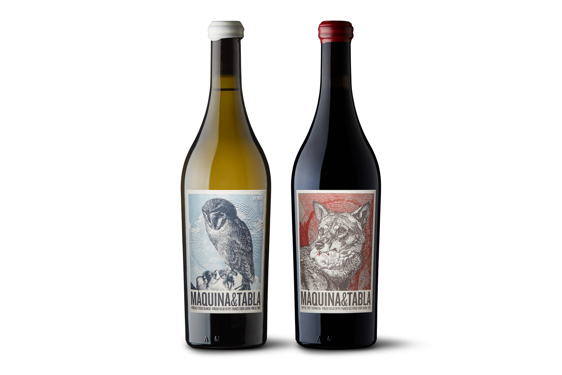
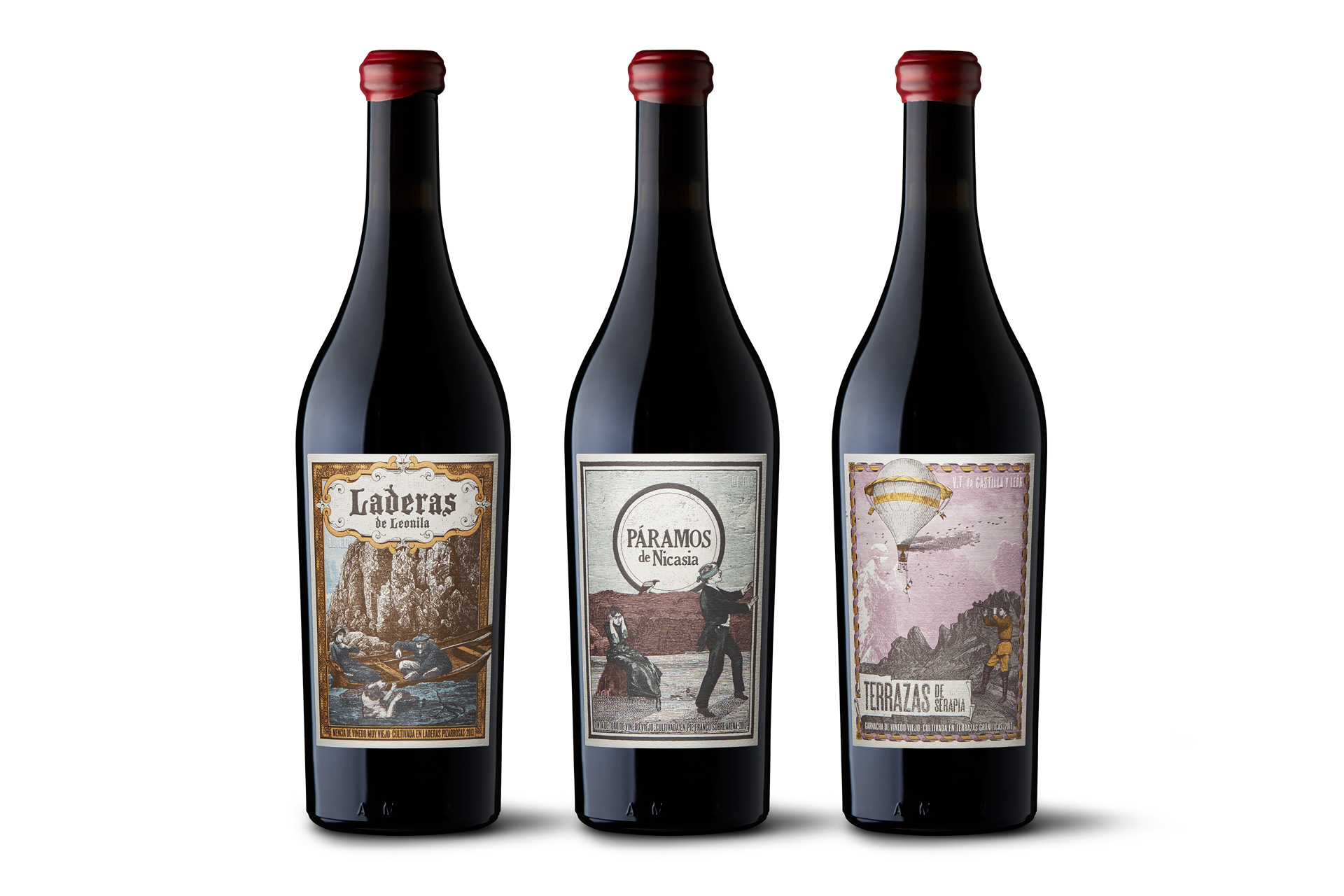
Clarity, difference, versatility and power. The works of Joan Josep Bertran show conviction, an unswerving desire to mould graphic solutions that give the brand and the product an iconic position with robust cultural symbolism. Furthermore, these solutions can stimulate the recipient’s experience. Since 2003, his studio has carried out highly charismatic identity projects for the wine sector and we appreciate the balance between the firmness of its principles and its ability to adapt.
Màquina & Tabla is a J. J. Bertran project in a pure state: it is rich, complex, open and very devoted to the conceptual demands of the client, which requires absolute precision. This series of labels captures its exhaustive work defining meanings and values. The goal is to represent the aura of an attitude and a particular conception of how viticulture should be written into the splendid and terrible course of nature.
Màquina & Tabla’s labels are open to many possible interpretations. What do they aim to convey? An allegory, instigated by the client, about the relationship and struggle between humans and nature, in which nature usually and must have the final word. Each label shows a particular facet of this struggle and together they all make up a single discourse.
The visual tone contributes to that relationship marked by tension. Exactly. It aims to reflect a paradigm while contradicting it at the same time, creating mysterious meanings. Through the illustrations created by Xavi Forné, we achieved an artistic language that mixes irony with the macabre, the subject of death and the threat of death, with the detail and romantic fantasy of unseen landscapes. The configuration of the message, which is the final and sacred goal of our work, situates the labels within an apparently classic and aesthetic code, but gives it a twist by unfolding a supposedly strange and conceptually contemporary narrative. It is a study of contrasts that appeals to the instincts to explain the duality between man and animal, nature and reason, in which the organic will prevail.
What does this graphic and narrative complexity have to do with winemaking itself? Everything. It tries to express it, capture its atmosphere, that effort to interact with nature by knowing or sensing its power, which sometimes can be deadly. Màquina & Tabla is a project very closely linked to specific geographical and natural origins, present in the labels, but also free of typical connotations and detached from the weight of conventional aesthetic discourses of wrapping and packaging.
How has the more physical, tactile and technical part of the labels helped to communicate this whole world? In a fundamental way. The production design is humble, but we still manage to achieve a volumetric ensemble that creates another element of enjoyment across short distances. The paper is Freelife Merida Cream, apparently natural and somewhat rustic. We didn’t want an overproduced label stuck in the most commercial parameters, but just the opposite: austere, interesting and truthful.
What problems were involved in printing? It was essential to maintain the appearance and texture of an old engraving in a very small format with highly compressed hatching. The idea was to achieve the look of an old lithographic press in offset plates. It was a challenge to achieve a reproduction with such detail: the blacks mixed together and the greys disappeared from light areas. We had to undertake very careful photomechanical work to come up with the right density. Aside from this, production was deceptively simple, with just two or three inks and debossing. But it required a lot of agile rectification with the machines still running until the optimal result was achieved.
At Màquina & Tabla, the graphic concept and concept of production come together. Yes, and that is the main value provided by Vidal & Armadans: optimising the technical part of the idea in full collaboration. It is the realisation that the label never ends with the delivery of an original. Without cooperation between the designer and the printer, it would be very difficult to interpret the piece and transfer it to paper correctly.


