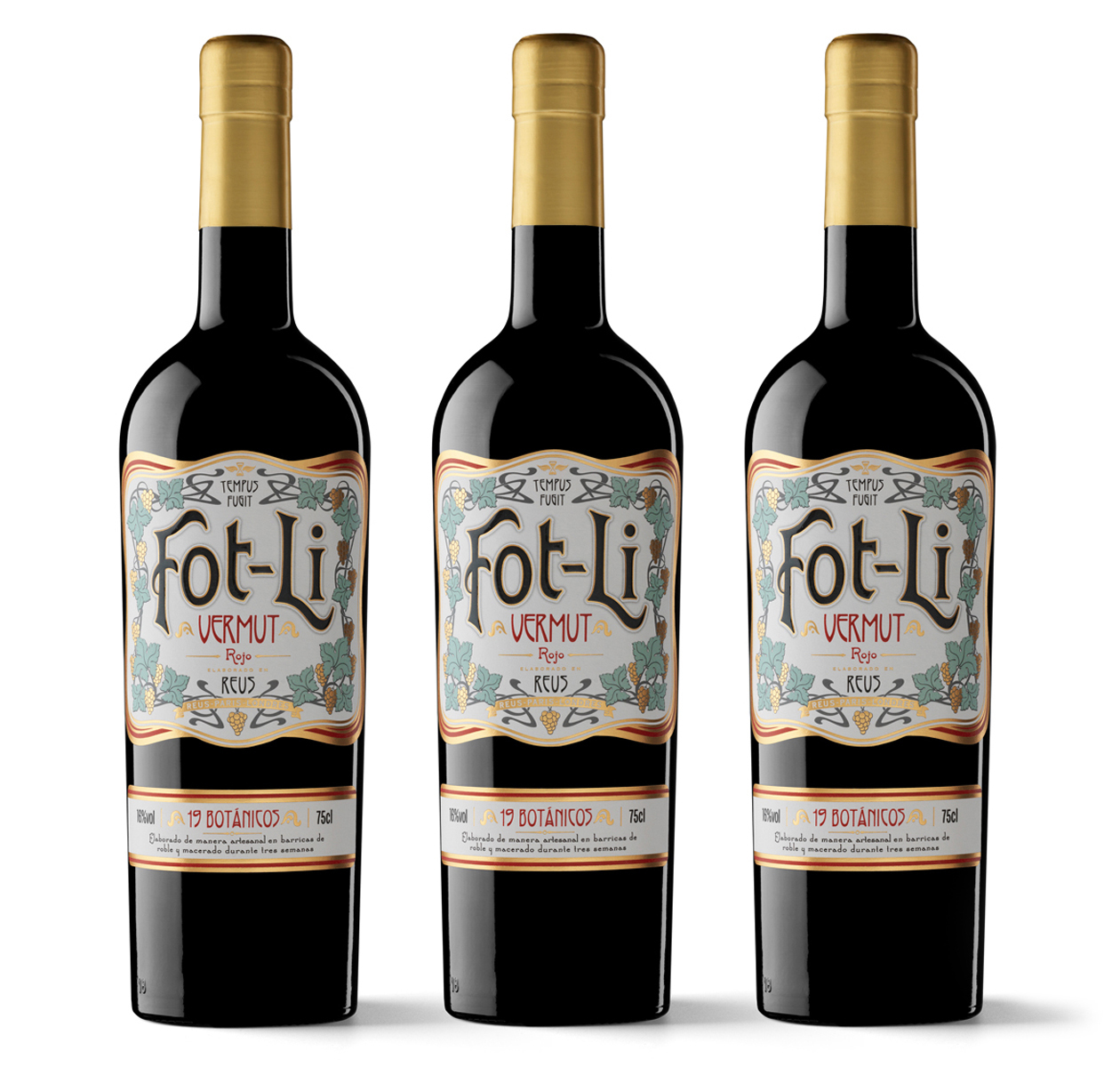
The typeface, brand name, formal resources… everything about Fot-li takes us back to Reus in the late 19th century, when this city in southern Catalonia was one of the world’s foremost centres in the liquor trade, along with London and Paris. Here vermouth, which was of Italian origin, found large and fertile terrain for its development as a commercial product; the best known date is 1892, when it is believed that vermouth was made in the city for the first time. According to historical convention, it was also the year that marked the zenith of modernisme (Catalan Art Nouveau) as a movement covering all artistic expressions and applied arts.
Founded in 2007 by Luis Vázquez Pinteño, the Jerez-based studio Typesense has put these culturally rooted meanings in play with the conceptualisation of a historicist solution for the Fot-li vermouth label. It is a creative approach based on the codes of modernisme that conforms particularly well to the constraints and possibilities of printing work. By the way, Vidal & Armadans is contemporaneous with the date cited above: it was founded in 1893.
What values do you want to convey with the Fot-li label? Our fundamental concepts for developing this identity are tradition, authenticity, uniqueness and masterful creation. The briefing was simple and concise: Fot-li, a colloquial Catalan expression that is like a shout of encouragement or joy, is a traditional recipe vermouth from Reus crafted by a hundred-year-old company. Emphasising the place of origin and a splendorous past is essential for creating the brand.
To make the message as literal and credible as possible, we give it a historical touch with graphic resources inspired by the modernista architecture of Reus and the graphic legacy of old labels from that golden age. The label has a certain vernacular look at the same time. It is not overly designed and looks like it belongs more to a town than to a city.
How has the product been received? According to sales, it seems that the market is responding quite well. The brand’s owners are very happy with the results. We even won an award for the design: the Vinari Award 2017 for best vermouth packaging.
Fot-li seems to represent the quintessence of vintage style, but filtered through markedly local language. What path did it take for current consumer culture to grant it the name vintage? Since the term vintage is not merely used as a graphic fad but also as an honest and substantial description of a product’s credentials and origin, it will always be valid as a resource and as a way to reclaim a legitimate historical legacy.
It is especially valid for this type of product. Yes, maybe because vermouth is a drink with over one hundred years of history.
At Typesense you have worked on other packaging projects for vermouth. What are the prospects for this segment or product category? We are just humble typographers and graphic designers, not market analysts, so we don’t know what will happen with the consumption of vermouth in the future. But as long as there is demand, there will certainly be those who want a piece of the pie.
How do you stand out with so much increasing brand fragmentation? With the product itself. At the end of the day, no two products are the same. They may be similar, and here is where the designer’s challenge lies: in knowing how to capture and visually express that point of distinction.
To some extent it reminds us of what happened a century ago, when there were dozens of brands of soda, soft drinks and even beer, each with a great local connection. How do you see this scenario? Fascinating. This situation means that we have to work hard to find new ideas and explore new ways to articulate them in order to create an identity and give a personality to every brand and product.
Focusing on the technical side, what were you looking for? And what did you expect from the print? We are very meticulous with the final touches and whenever we send something to the printer, we get a little knot in the pit of our stomach because what we have in mind is now in the hands of other people. In this project, the printer knew exactly how to capture the spirit of the design and could not have done a better job.
What are the essential technical characteristics of Fot-li? The label is printed on high quality laid paper in four direct inks with a gold stamping and embossed serigraphy over the brand. The brand is also shaded subtly to make it stand out even more.
Generally speaking, what is the role of print’s effects on the development of a brand? We’re used to screens with millions of colours, but where everything is flat. In packaging, which is a three-dimensional object, the design comes alive with the print’s effects: they add interest and value to the brand that you can see, touch and smell!

