In the work of Cristina Hernanz, ideas such as culture, freedom and consistency are as important as exploring, listening and rethinking. Her approach to design and packaging is brave, systematic and engaged. Always very close to literature and the word, she quotes Richard Sennett to illustrate something that is central to her work: the quest for the character of each project.
“The old English speakers, and indeed writers going back to antiquity, were in no doubt about the meaning of ‘character’: it is the ethical value we place on our own desires and on our relations to others. Horace writes that the character of a man depends on his connections to the world. In this sense, ‘character’ is a more encompassing term than its more modern offspring, ‘personality’, which concerns desires and sentiments which may fester within, witnessed by no one else.”
These words resonate powerfully in the graphic programme of Tinedo’s labels. In line with the very identity of this winery from La Mancha, it is a very personal project resulting in a unique image replete with meaning and emotion.
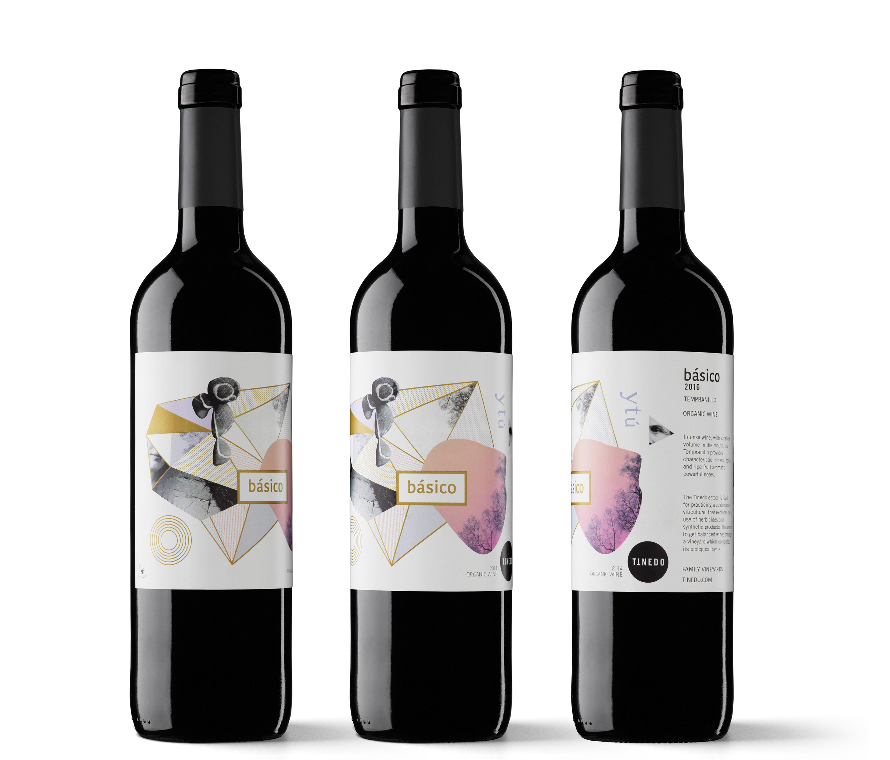
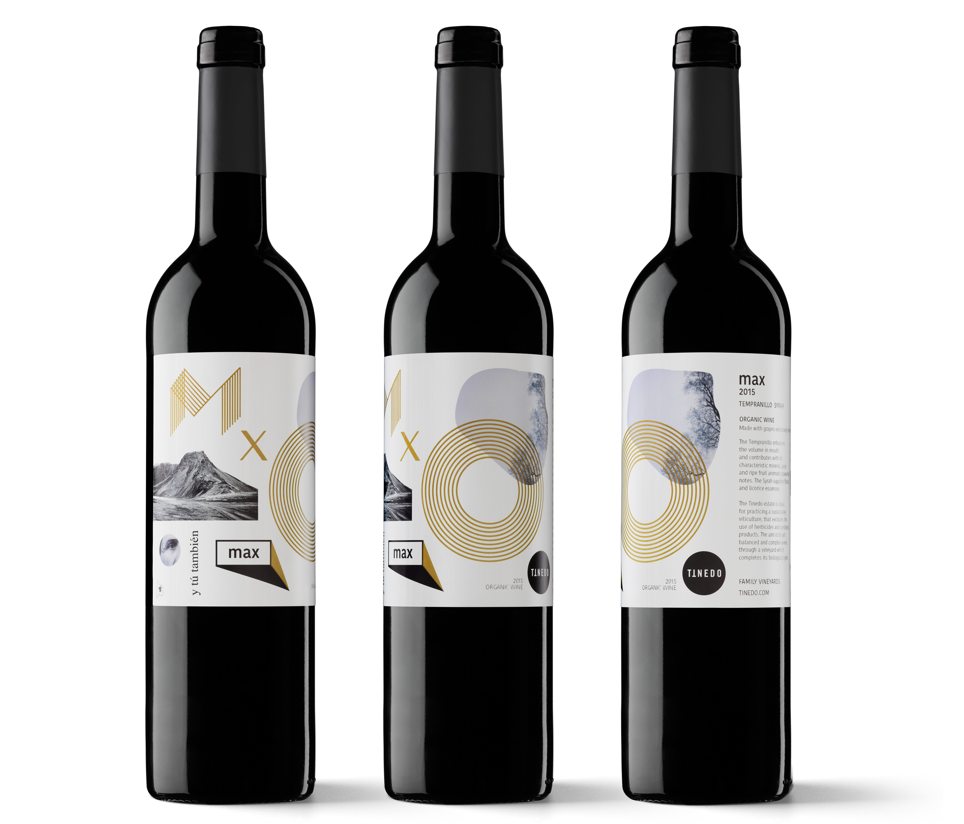
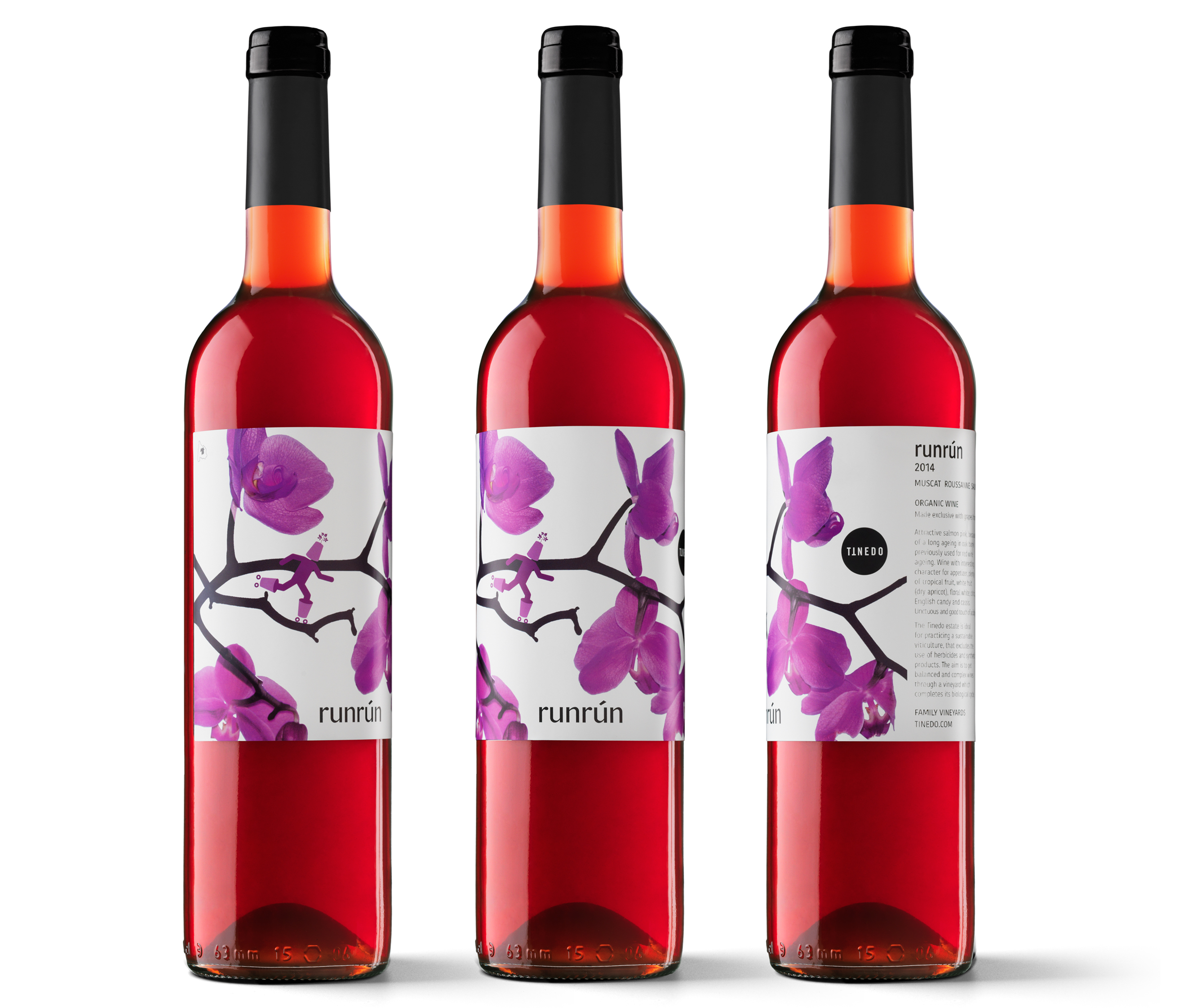
With Tinedo, you are taking a road less travelled in wine packaging, halfway between contemporary art, photo collage and experimental graphic work. How would you describe these labels? The key words are freedom and consistency. We try to bestow all the elements with meaning, whether cryptic or more explicit, and to form a syntagma together. We want to convey that the wine is the land and the people that work it, but also those who drink it, for they are an essential part of the process.
Of course there is a commercial aspect. You have to sell wine and it is difficult to draw attention in the aisle or at a fair. Currently there is a massive influx of illustrations: some beautiful, others that seem less appropriate and some that shout. With Tinedo, we want to draw attention without shouting, appealing to intelligence, calm surprise and something to think about. At the time, we considered something purely typographical, but we came up with this path of graphic illustration, with powerful elements and less organic.
A creative path that seeks to appeal to intelligence
A creative path that seeks to appeal to intelligence
A creative path that seeks to appeal to intelligence
A creative path that seeks to appeal to intelligence
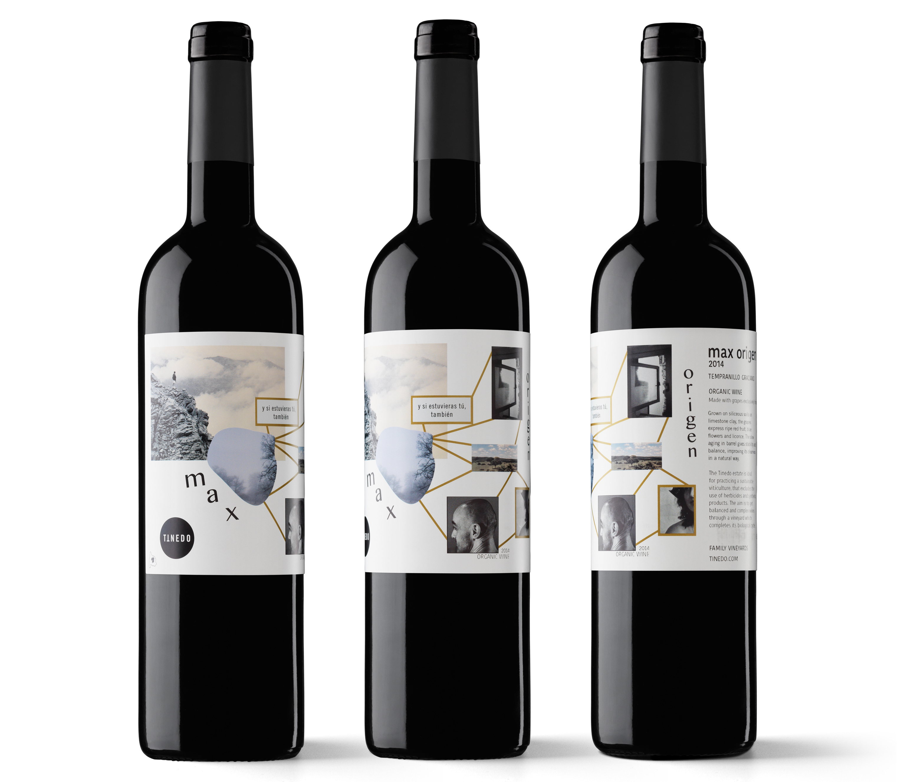
The brief texts that appear on the labels seem very important. What’s their story? Those are brief passages of Blackout, a collage poem by Nanni Balestrini. The sentence “And if you were here, as well” conveys the sensation of sharing, but also of freedom in sharing.
Then, in all the work with Tinedo, there is always a non-explicit textual part: “Another Mancha is possible”. The reference to Quixote, the man of La Mancha, is constant: “Freedom, Sancho, is one of the most precious gifts that heaven has bestowed upon men”. All of Cervantes’ work is a hymn to freedom. On the other hand, others have rightfully said that the result reflects a highly heteronormative context. I think that this is because we are showing a very personal world, with materials of great emotional weight, featuring Manuel and Yolanda, the owners of Tinedo, photographed by Manuel himself. And yes, they are a hetero couple.
How does the work unfold as a project and as a commission? The keys are clear: honesty, cultural communication and respect. We only had one condition: one of the wines, which was being redesigned, had to be called Básico. We started with the name Max. This was a tribute to Manuel’s father, Máximo, and works as a name in all languages. It looks good graphically and it’s a character. Tinedo always has characters. They were female before.
The process is always the same. We make a thousand sketches, in different lines, all of them conceptually related. We share ideas and finally meet to choose the line we want to work on. We stick these labels on the bottles and decide where we want to go. We start working on the final design from there, unhurriedly. If something better comes up along the way, we have no problem starting over.
How would you describe a client that allows and even stimulates this kind of project? Manuel is creative, generous and brave. He is also humble and has his feet on the ground. He is a great amateur photographer, so we can work with images he took. We decided to create a personal world from the first, which we could later continue to vary. I think that we don’t only have to design for consumers, but also for our clients. They have to feel happy with their image and feel that it reflects them. In the beginning, everyone said that he was crazy, that this graphic design was going to bankrupt him. But Manuel not only trusts me, he often goes much further and we have to stop him. The constant effort not to work on the obvious is a pleasure and has its reward. We never create any element, no matter how small, without looking for another spin on it and without trying to make it unique.
What are your graphic and visual influences? It’s easier for me to start talking about non-graphic influences: literature, words, music, painting; sensations, emotional images. Like the wind between the leaves and the grass, an image that was either before or after having read The Canterville Ghost or The Grass Harp by Truman Capote and having seen The Empire of Light by Magritte.
In terms of graphic influences, right away I’ll say Werner Jeker, Hort and Les Graphiquants. I’m also fascinated by Experimental Jetset and M/M (Paris). I visit trendlist.org when I feel that I am letting myself get carried along by a trend, in order to avoid that, but I also discover interesting designers there. As for wine labels, Tinedo’s non-gold gilding owes much to a wine by Xavier Bas that I saw at ProWein. The first ones that we did borrow a lot from a Mash label. I really like Eduardo del Fraile, Joan Josep Bertran and his 8, as well as Bendita Gloria’s specific design, which is really well made. Fernando Gutiérrez’s labels for Telmo Rodríguez, Moruba’s wrapping for De Bardos…
My mentor was Gabriel Martínez, from LSDspace. With him and Sonia Díez, we define all the work on Tinedo’s identity.
What appeals to you the most about a label? That it is intelligent, that it doesn’t shout, that it is not random or anecdotal, that it is not “just pretty”, although if it is “just really pretty”, it can be marvellous. If it has an illustration, I like it when it is not separate from the label and when the font is perfect. I’ll add some others: those of Tomàs Cusiné, 4kilos, López de Haro, Matsu, the atmosphere of Nunci by Eumogràfic… It would be impossible to give a complete list.
Let’s go back to the Tinedo labels. How were they printed? They are very simple in terms of effects. The Básico, Max and Max Origen series uses a fifth direct ink with a greenish tone. Manuel wanted to try it with gilding, but I was reluctant. I didn’t think that it went well with Tinedo’s character. We found this “non-gold gilding” solution that we both liked. Vidal & Armadans added a tiny drop of gold to the green and turned it into the brass that we had dreamed of.
What role does printing play in constructing a message? A fundamental one. A poorly printed label – which we have done – has a careless, poor-quality effect. Labels with illustrations may become pasty or have very unusual turns of colour, arms that looks like a robot’s or yellow or green faces. A well-printed label provokes nearly subliminal pleasure. When you pick it up, it feels better in your hand.


