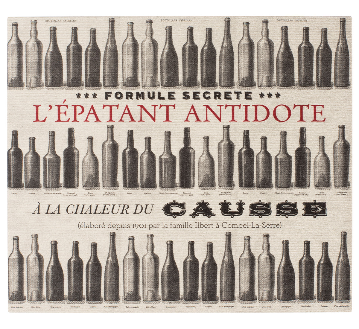
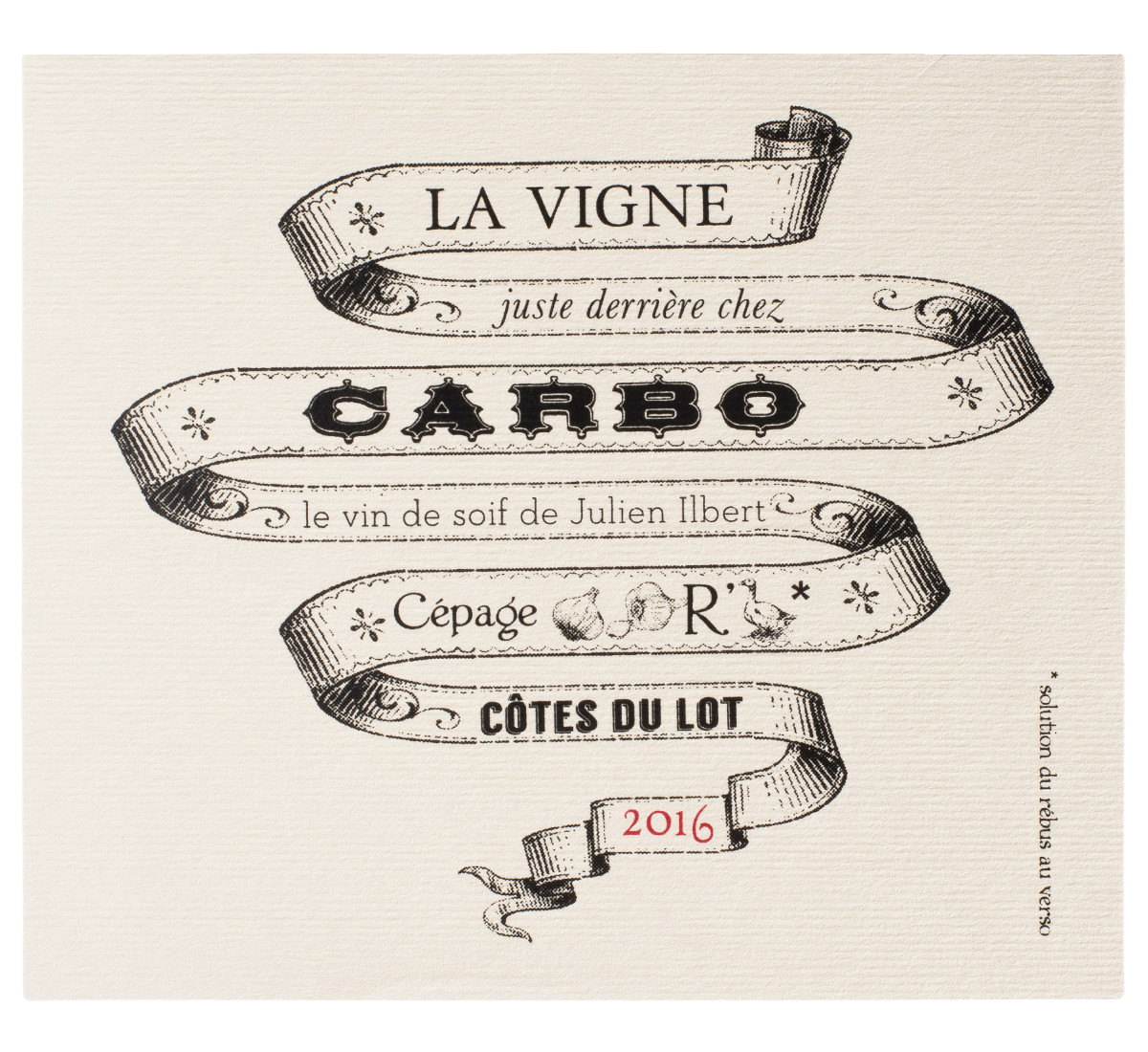
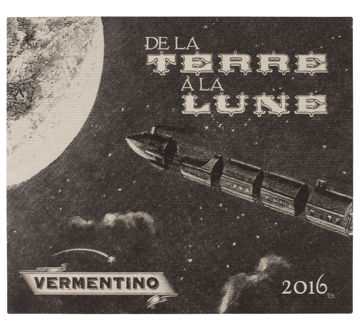
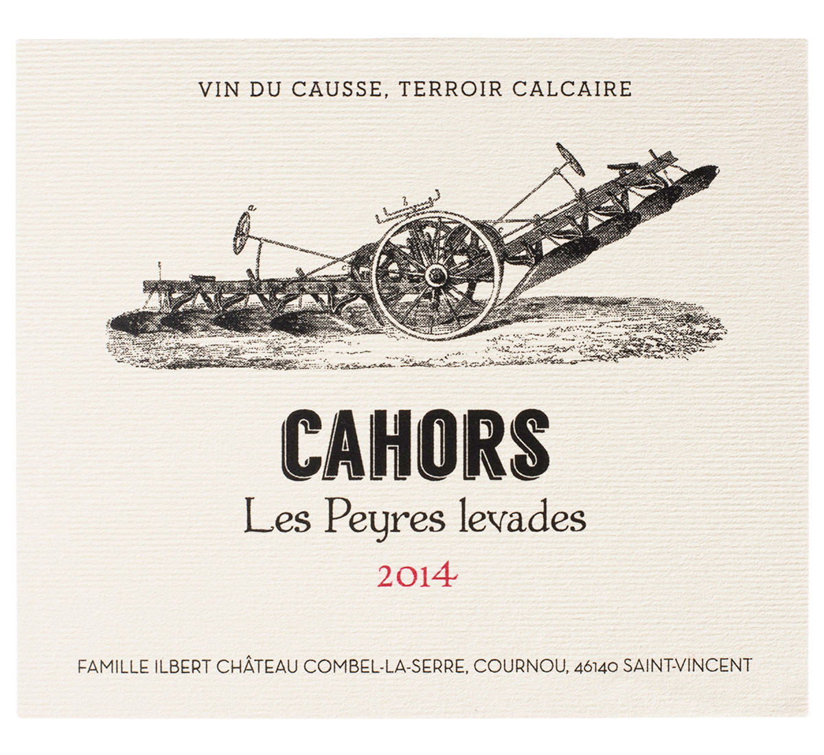
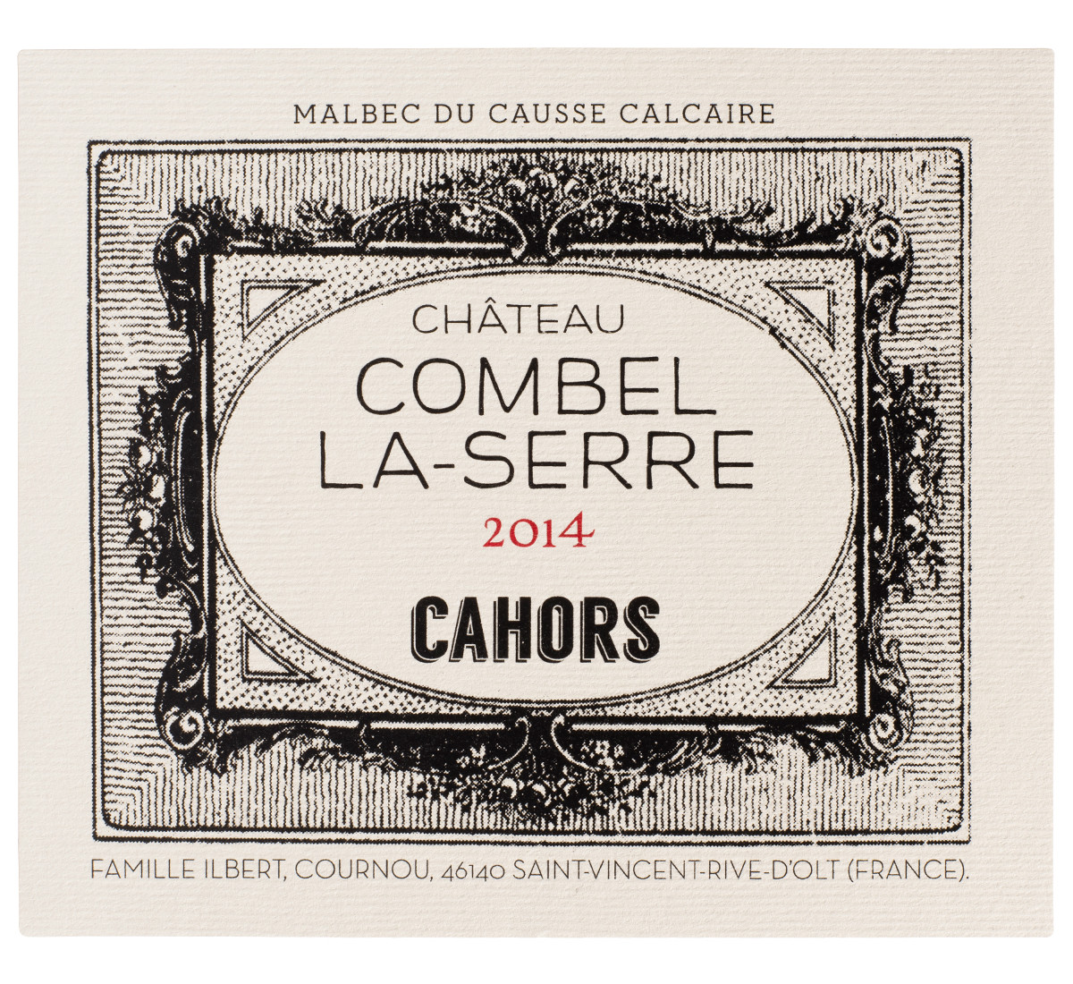
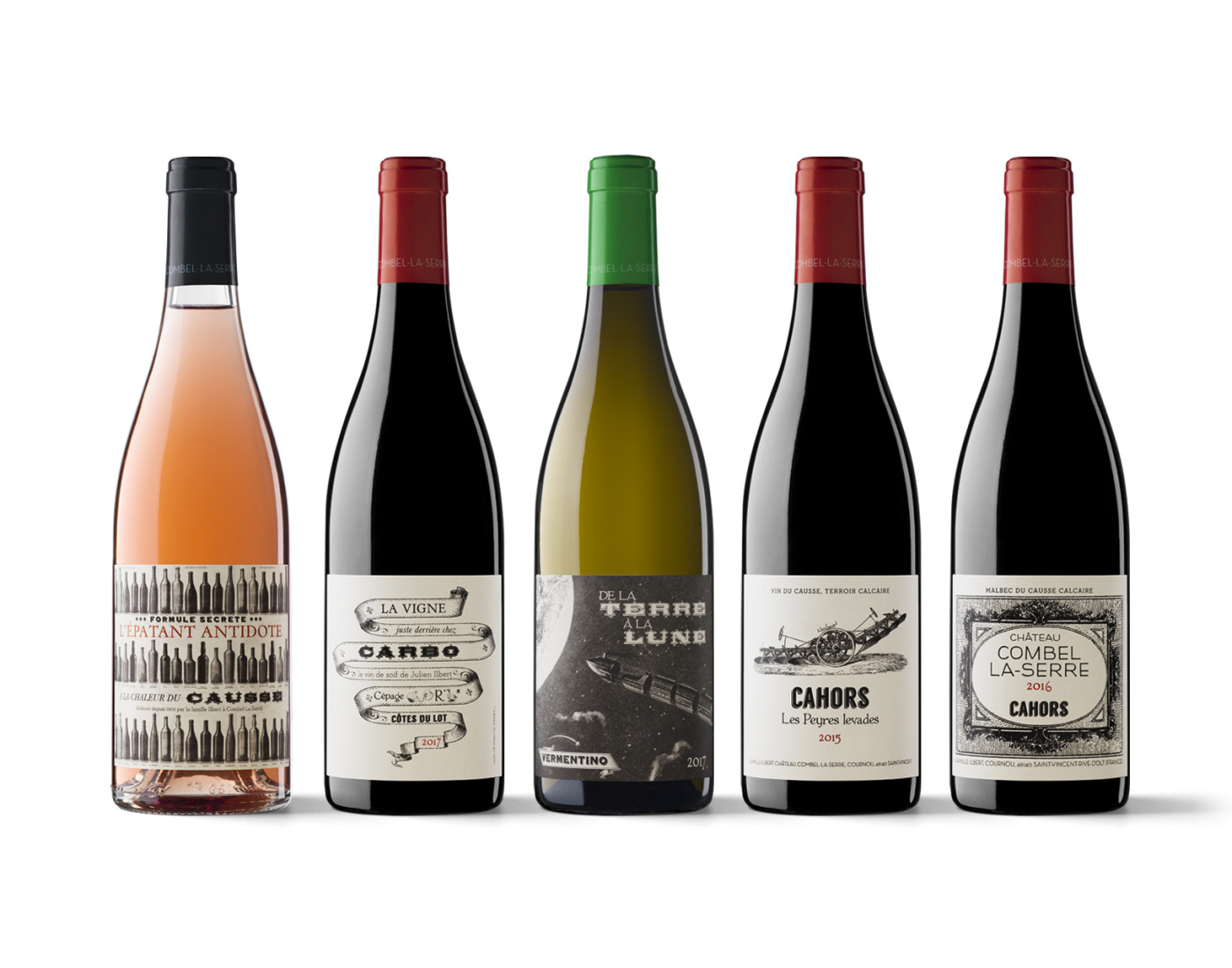
Vincent Pousson’s labels can be recognised at first glance whether they are for Spanish or French wineries. He has made an art from combining a touch of retro with a decidedly modern formal composition. This has lead to something extraordinarily attractive and powerful, and also undeniably efficient in terms of communication. Without wishing to set a precedent, Joan Armadans talks to us here about the work and relationship with our printing press of this talented designer, who is almost as difficult to classify as he is to locate.
Vidal & Armadans has been printing Vincent Pousson’s labels for many years. What do you like most about his work? His originality. He creates overwhelmingly personal designs. His projects are always truly unique and different from almost everything else. And I don’t just mean in France, where graphic design used in packaging tends to have a decidedly classic feel that can become trivial and monotonous when taken to an extreme. Quite literally, many of his labels have an air of déjà vu about them. So Pousson’s visual creativity has helped to create an opening in the French market. He contributes freshness, distinction, innovation and a much more modern feel. Or, more than modern, fresh and free.
What is it like to work with Pousson? What is your relationship like with a designer who is not very extravagant and perhaps even gives the impression of being slightly secretive? Vincent is demanding but, at the same time, he is not the type of person who digs his heels in. He doesn’t get bogged down with his own design, but is used to listening and assessing proposals. He clearly represents the type of designer we like to collaborate with: he accepts advice and displays the necessary confidence for a constructive professional partnership.
You work well with him. That’s right, we’ve established a positive working method over the years, an advisable relationship between a printer and a designer. As regards his seemingly “secretive” nature, perhaps it is because he spends a lot more time in France than in Spain and he has of course recently worked a lot more for French wineries.
What printing techniques do Pousson labels usually require? We screen-print his labels whenever we can. I think Vincent likes this method as much as we do. But we are really open to exploring any techniques and materials with him. Paper, reliefs, etc. The range is wide, rich and complex, and it is crucial to find and combine the possibilities that best contribute to creating a brand and communicating it. We like it when wineries and companies ask us to participate in the stage of defining the brand concept of a wine or product, beyond that of printing.
Vidal & Armadans has been growing across the border for years now. What is it like to print for French wineries in France? It is more complicated than in Spain because, as I mentioned, a very classic, passive and stagnant idea of design still prevails there. You get the feeling in many places that they are afraid to take risks, so fresh, modern designs created to reach much of today’s audience don’t usually appear. Nevertheless, the changes we have noticed over the past few years when we have been operating in France are rather encouraging. I hope this trend for change and adopting newer graphic codes and communication languages continues.
What do Vincent Pousson’s recent projects in France have in common, such as L’Épatant, La Vigne juste derrière chez Carbo, De la Terre à la Lune, Les Peyres levades and Château Combel-la-Serre? They are largely based on the inspiration of antique illustrations, as if taken from some of those delightful volumes that could be found in the old bookshops of small provincial French towns. After printing some tests, we noticed that the best paper to emphasise his designs was Acquerello Perla. It is silkscreen printing that includes several effects in order to enhance certain parts of the label. We are very satisfied with the results. They are vibrant. It is like bringing back to life those old, such historically personal motifs.
It is certainly an interesting process. From your general experience as printers, where would you say that design is heading? It is difficult to risk giving a conclusive answer. The tastes of end customers are fortunately very different and diverse and this greatly expands the visual possibilities and the contribution of graphic design. Remaining true to your ideas is what I believe is crucial, beyond that of fashions and styles. If you remain faithful to something deeper than current trends, you will sooner or later ultimately stand out from the crowd.

